
The Importance of a Mobile Responsive Website (2022)

Internet usage on mobile devices overtook internet usage on desktops in 2016. And as of 2020, over 3 billion people use smartphones. It’s undeniable that smartphones have had an impact on consumer habits and attention. For that reason, it’s become essential for businesses to cater to consumers on other devices besides just the desktop. Along come mobile responsive websites. They help accommodate websites to display on devices of all sizes.
Responsive websites were a luxurious element when first rolled out in 2015. Now, having a responsive website has become a requirement in 2022. A mobile responsive website automatically scales its content to match the screen size it is being viewed on. Most websites these days have implemented this design feature. Additionally, Google considers it a ranking factor.
Mobile responsive websites are important features because they:
- Are cost-effective and easier to manage
- Offer flexibility to both the creator of the website and consumers
- Improve the user/consumer experience (ROI)
- Increase relevance
- Achieve higher Google rankings
- Increase reach
Before diving into all the benefits of a mobile responsive design, we will go into what a responsive design is.
What is a mobile responsive website?
A responsive web design implements a single system. This means that it only requires one URL. This one URL implements a flexible layout that will change according to screen size. Below, you can refer to a mobile responsive website shown on different device sizes.
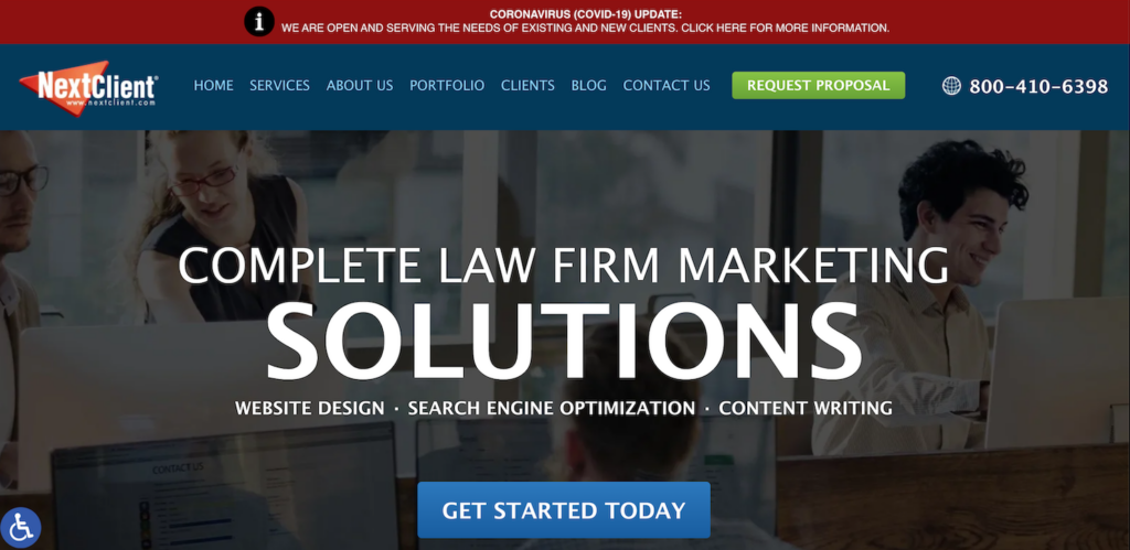
Desktop
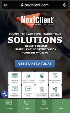
Mobile
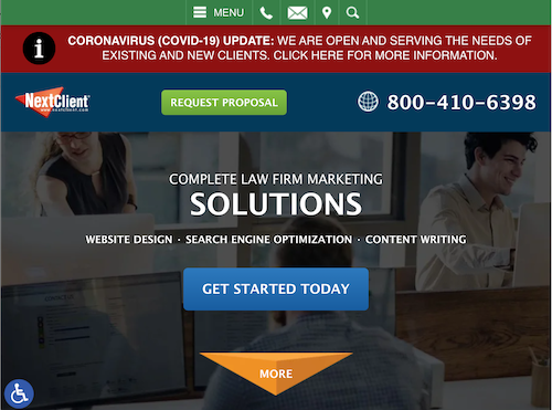
Tablet
In the past, it was common practice for businesses to maintain a different website for each device, such as one for the smartphone and one for the desktop. However, this practice can quickly add up with the increasing number of devices that can access the internet. Examples include desktops, smartphones of different sizes, tablets, laptops, smart TVs, digital cameras, and more!
If you have an online business or need to be found online, it’s crucial that your website is mobile responsive. We live in a multi-screen society. Over 57% of consumers use multiple screens to access the same website. According to Google, over 53% of smartphone consumers will leave a webpage if it takes longer than three seconds to load. So it’s important that your website meets the needs of each medium.
The Benefits of a Responsive Web Design (RWD)
-
-
It’s cost-effective and easier to manage
-
Implementing a responsive web design means having only one URL. Before RWDs, having many URLs for different device sizes was a common practice. You’d have to pay for hosting many sites and implement a different design for each website. This can be costly and more difficult to manage over time.
-
-
Offers flexibility
-
Additionally, with one URL there is more flexibility to keep your website updated and current. Making changes to one website URL is much simpler than doing the same for a lot of URLs. Design edits and quick tweaks only have to be done once.
-
-
Improve the user/consumer experience
-
A mobile responsive design will ensure a website can be viewed on multiple devices. As a result, different features will be offered to users of different devices. For example, smartphone users should not be scrolling horizontally or zooming into the text with an RWD.
-
-
Increased Relevance
-
Design elements can cater to your message based on the device. Take the above smartphone example further. The smartphone could also use a click-call-to-action. This makes sense for a user who would be tapping the screen. In contrast, the desktop web version could apply a more lead-inquiry-based design. This would accommodate users who are more likely to type in their information.
-
-
Higher Google Rankings
-
On April 21st, 2015, Google announced mobile-friendliness as a ranking factor. With better mobile responsiveness, your website can rank higher. Higher results mean more website visitors, more potential customers, and more conversions.
-
-
Increased Reach
-
As a result of higher search engine rankings, you can capture a larger audience. Satisfied tablet and smartphone users will more likely convert to calls and clients. You will capture an audience beyond desktop users. When selling a service online, having a bigger reach is beneficial to precisely determining your customer base.
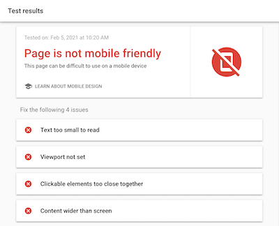
Have a Website? Check for Mobile Responsiveness
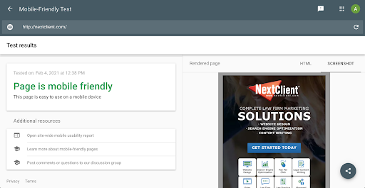
Google offers a free mobile-friendly test online: https://search.google.com/test/mobile-friendly
Did you fail the mobile responsive test, or could your business benefit from professional help with any web design needs? Our team at NextClient can make sure that your website is up-to-date with modern web design standards.